The 21 Best Mobile App Design Examples (Complete Guide)


Individuals are spending the vast majority of their digital time - 90%, to be exact - interacting with apps rather than browsing the web. From chatting and sharing photos to playing games, app usage has become an integral part of modern life. Given this trend, it's crucial for businesses to develop a focused mobile approach.
Implementing a mobile app not only expands a business's reach to a wider audience but also refines marketing tactics, adds value for users, boosts brand visibility, and enhances customer interaction and loyalty. Additionally, having a mobile app can give businesses an edge over competitors.
So, how do you go about making a good business app? In this article, we will guide you through various aspects of app design, ensuring that you can turn your initial app idea into a live, fully-functional app accessible across multiple app stores. Whether you're contemplating the nuances of iOS app design, Android app design, or even iPad app design, we have you covered.
From user experience tips to budget-friendly app design solutions and top app design software recommendations, this article aims to be your comprehensive guide to app design excellence.
App Design Templates
Explore these app design snapshots; they're packed with creative ideas that could spark your imagination.


Get inspired by more app designs
How to design a Mobile App
Let's dive into the multifaceted journey of app design. Here's a breakdown of how you can transform your app idea into a full-fledged product in nine steps:
1. Define the Scope
When it comes to app design, understanding the scope is critical. The scope encompasses the app's goals, its target audience, key features, and visual elements. Answering questions like these will help you clearly establish the scope, laying a strong foundation for your app design and subsequent development stages.
2. Conduct User and Market Research
The next crucial step is user and market research. Investigate your target audience, analyze competitors, conduct a SWOT analysis, and establish a business plan. This research will inform your app design, helping you identify gaps in the market that your app could fill.
3. Create the Product Requirements Document (PRD)
PRD serves as a comprehensive guide that the entire team refers to throughout the project. The document should cover product specifics, goals, assumptions, user stories, and design and interaction challenges. Effective PRD writing is crucial for app design and planning.
4. Draft a UX Wireframe
Wireframing is the skeleton of your app design. It provides a simplified visual representation of the app's layout and features, without going into aesthetic elements. The aim is to map out the app's workflow and overall structure.
5. Build a Clickable Prototype
Taking your app design to the next level involves creating a clickable prototype. This prototype serves as an interactive model of your app, offering stakeholders a near-final look at the app's design, layout, and functionality. Clickable prototypes are invaluable for refining your app design before coding begins.
6. Embark on UI Design
User Interface (UI) focuses on the look and feel of your app, making it an essential component of app design. After your wireframes and prototypes have been approved, you'll want to start with the UI design, choosing the appropriate visual elements such as colors, fonts, and buttons. The aim is to create an app design that is user-centric and visually appealing.
7. Develop the App
App design feeds directly into app development, which typically consists of back-end and front-end development. However, with no-code platforms such as Fliplet you have the flexibility to create an app design that you like without needing to know code.
8. Rigorous Testing
Your app design is not complete until it has been rigorously tested for functionality, usability, and aesthetics. Both beta testing and User Acceptance Testing (UAT) are recommended for gathering valuable feedback that could make or break your app design. We recommend building your app on a platform that enables you to design your app and test your app.
No-code platforms such as Fliplet enable you to test across the mobile, tablet, and desktop view so you can ensure your design is perfect across all different platforms.
9. Release Your App
Once your app design has been tested and refined, it's time for the big launch. For Android, you can directly upload your app on the Google Play Store. In contrast, iOS requires a review process to ensure that your app meets Apple's developer guidelines.
Remember, app design is an ongoing process. Continuous updates and refinements are key to maintaining an engaging and successful app.
What is App Design?
App design refers to the process of crafting the visual elements, user interface (UI), and user experience (UX) of a mobile or web application. The goal is to create an app that is not only aesthetically pleasing but also intuitive and user-friendly. This involves various stages such as wireframing, prototyping, and actual graphic design, all aimed at optimizing the app for usability, accessibility, and effective engagement with the user.
The end objective is to offer an application that resonates with the target audience, encourages user interaction, and ultimately, fulfills the intended functionality effectively.
What Platform Should I Design For?
Choosing the right platform is a pivotal decision in the app design process, as it significantly influences not only the user experience but also the reach and scalability of your application. In this section, we'll take a look at the intricacies of designing for various platforms, exploring iOS app design, Android app design, and iPad app design. Each of these platforms has its own set of guidelines and best practices that can impact the look and feel of your app.
By understanding the subtle differences of each, you'll be better equipped to create an app that shines, regardless of the device it's accessed on.
iOS App Design
There are more than 2.22 million iOS apps available on the Apple App Store. With so much competition on the market, you can't afford to have a lackluster iOS app design.
When crafting an iOS application, there are crucial factors to consider. Firstly, iOS stands out for its stability and user-friendliness, which enhances the overall user experience.
Another advantage is the streamlined process for identifying and resolving design imperfections. This facilitates prompt alterations and updates, ensuring your application maintains high usability standards.
Aesthetics are of the utmost importance for Apple users; they expect a contemporary and user-intuitive interface. Furthermore, it's essential to guarantee that your application functions seamlessly across all Apple devices, such as iPads, Apple Watches (if applicable), Macs, and others, to provide a unified user experience.
Here are our tips for good iOS app design:
- Simple design layout
- Utilize color to indicate interactive elements
- Adapt designs for both light and dark themes
- Choose a suitable typeface
- Use clickable touch screen elements
- Map the user flow between screens
Want to create an app for iPhone in less than a day? Check out these seven steps.
Android App Design
Google Play is one of the most popular mobile app vendors on the planet, offering over 3 million apps.
Designing for Android offers a more open and flexible environment compared to its Apple counterpart. This openness affords developers a broader range of options in terms of app creation and design.
For those new to app design, Google provides a comprehensive set of resources to assist in the learning process. What's more, the cost of designing and launching an app on the Android platform is typically lower than on iOS.
Like iOS, Android app designers must also consider a cohesive design that translates well across multiple devices, including wearables (if applicable), VR devices, Android Auto, and more. The diversity of devices and platforms supported by the Android ecosystem should be a key consideration during the design process.
Here are some factors to keep in mind when designing an app for Android:
- Try for a minimal design for better and easy user interaction
- Aim for one or two tasks per screen for simplicity
- Avoid overcrowding the screen with extraneous content
- Ensure headlines and text are succinct and understandable
- Utilize white space effectively
- Apply colors judiciously to prevent user confusion and adhere to brand color schemes
iPad App Design
Creating an iPad app that captures and retains user interest can be challenging given the competitive landscape. To design an effective and appealing iPad app, here are some essential tips to consider:
When it comes to iPad app design, simplicity is vital. The design should be straightforward, focusing on the main task at hand. It's essential to have a clear understanding of your target audience and the specific needs your app aims to fulfill. A simple design enhances user engagement and effectiveness.
The iPad's large screen is one of its defining features, providing a broader canvas for app design. This advantage should be fully leveraged by designers to create visually appealing and immersive experiences. Ensure that your app's design is optimized for the iPad's native resolution, allowing for clear and vibrant visuals.
It's important to resist the urge to overcrowd your app with too many features. A minimalistic design approach, focusing on essential controls and functionalities, can significantly enhance the user experience by reducing clutter and confusion. Keep your app's interface clean and user-friendly.
When designing your app for iPad, we recommend focusing on these key points:
- Incorporate high-quality visuals
- Design for accessibility
- Adjust your color palette for dark and light themes
- Construct clear in-app navigation
- Keep it simple
- Make information easy to find
Do you want to build a custom app without any coding? Follow these six simple steps to do so.
UX App Design Tips for the Best User Experience
People spend an average of four hours per day using apps on their smartphones. If you want one of those apps to be yours, you must consider your mobile app UX.
38% of users are willing to download an app if they need it to make a purchase, but half will uninstall it after completing the transaction. In fact, half of all apps are uninstalled within 30 days.
And, to make things even more complicated, the average user only engages with five apps on a regular basis.
The user experience (UX) of your app should consistently demonstrate its worth. An app that effectively addresses a user's needs while being straightforward and pleasant to use is more likely to engage users over the long term. This means you'll not only keep more users but also see an increase in active users. Enhanced user retention and activity contribute to a higher lifetime value, fueling the growth of your app.
Key Do's and Don'ts for Mobile App UI Design
Directing User Actions with Precision
- Avoid using valuable screen space for unclear calls to action or unnecessary content.
- Provide straightforward access to frequently used tasks.
- Employ subtle animations to guide users on required actions, like typing or toggling a switch.
- Offer immediate feedback or validation to assure users that their actions are being processed. Use engaging animations, like a rotating timer, especially during waiting times.
- Simplify the process for users to seek help, such as incorporating click-to-call or chat functions.
Streamlining Onboarding with Intuitive Navigation
- Ensure that search functionalities are easily discoverable, not hidden within menus.
- Avoid requiring users to pinch for zooming or horizontally scroll through content.
- Provide a single-click option to return to the Home screen.
- Keep primary links constantly visible, relegating less important items to collapsible menus if necessary.
Reducing Disruptions in Task Flow
- Aim for a seamless transition between desktop and mobile platforms, retaining as much user data as possible.
- Avoid disrupting the user experience with pop-ups or external links.
- Simplify complex processes into manageable steps.
- Introduce alternative input methods like voice commands, which are increasingly preferred by users.
Ensuring Every Design Element is Purposeful
- Avoid small, difficult-to-select targets. A minimum size of 44px is advisable.
- Make data input user-friendly with tools like visual calendars and simplified forms.
- Refrain from adding animations without a clear purpose, focusing instead on a design where each element serves a function.
- Create a clear visual hierarchy using typography and contrast, and facilitate one-handed navigation by placing key elements within easy thumb reach.
Being Considerate with User Requests
- Don't force upfront registration, blocking user exploration.
- Don't request data without a clear justification.
- Enable easy sign-on options with existing accounts like Facebook or Google.
- Offer guest checkout options for convenience.
Inclusivity
- Ensure your design is accessible to all users, irrespective of their abilities.
- Use inclusive language and imagery in your app.
- Embrace a diverse team to gain a wide range of perspectives and experiences.
- Stay informed about your users to ensure your app resonates with them.
Personalizing User Experience
- Avoid sending generic marketing communications.
- Employ personalized push notifications to reach users effectively.
- Invest in a thoughtful onboarding process and encourage user customization.
- Continuously gather user feedback and behavioral data to enhance the app experience.
Incorporating Engaging Elements
- Avoid dull lists of instructions. Use gamification and rewards to maintain user interest.
- Ensure rewards are meaningful, unlocking features or offering discounts.
- Introduce elements of competition, like challenges and leaderboards, to motivate users.
Get these essentials right, and your app could secure a spot on users' home screens. Now you know the do's and don'ts of mobile app design, take a look at the 16 Top Features of a Successful Mobile App.
When you design your app, think hard about what you want your users to do, then make it really easy for them to do that. Always try to make things simpler, quicker, and more fun for the people using your app. Technology can help, but the best way to know if your app is good is by seeing what real users say about it.
How to design an app for free
Designing an app can often be expensive and time-consuming, but it doesn't have to be. Fliplet offers a cost-effective and efficient outcome with our pre-designed solutions. These solutions provide a solid foundation for creating your own app, eliminating the need for extensive design experience or resources.
With Fliplet, customization is key; you can upload your own designs, fonts, colors, and more to match your vision. Often, the built-in features are sufficient to craft a fully operational app, ready to be launched on both the iOS and Google Play stores directly from the platform.

Fliplet enables anyone to develop prototypes and apps for both Apple and Android users. The platform offers a risk-free beginning, enabling you to design and test your app on your phone. Our emphasis on user interface design ensures that your app caters well to all mobile device users as well as desktop users. Moreover, we facilitate the collection of user feedback and input through platform features such as push notifications, providing valuable insights from real users to refine your app to perfection.
What sets Fliplet apart is our straightforward approach to app design, making it accessible for creators of all skill levels to forge mobile applications. The ability to preview your mobile app design on your own device before publication is invaluable. This feature enables you to understand the user experience firsthand, allowing for the anticipation of user navigation patterns, optimization for various screen sizes, and ensuring that the app is user-friendly.
This foresight is crucial as it addresses key factors that can make or break user retention. And the best thing? You can start creating your app for book a demo.
Here's how you can design an app for free using Fliplet's pre-designed solutions:
- Choose a Template: Browse through Fliplet's library of solutions to find one that suits your app's purpose. Whether it's for business, education, events, or any other domain, there's likely a solution that fits your needs.
- Customize your Design: Once you've selected a template, you can start customizing it to match your brand and requirements. Adjust colors, fonts, and layouts to create a unique look and feel for your app.
- Add Content and Features: Incorporate your own content into the solution. With Fliplet's user-friendly interface, you can easily add text, images, videos, and other interactive elements. You can also integrate various features like forms, maps, and social media feeds to enhance functionality.
- Test your App: Before making your app live, it's essential to test it thoroughly. Fliplet allows you to preview your app on different devices, ensuring that it looks great and functions smoothly across all platforms.
- Publish and Share: Once you're satisfied with your design, you can publish your app. Fliplet makes it simple: you can create one app that works on mobile, tablet, and desktop. Fliplet apps are compatible across Apple and Android devices.
By leveraging Fliplet's pre-designed solutions, you can design a professional and functional app for free, saving both time and money. This approach allows you to focus on the content and features that matter most to your users, without getting bogged down by the complexities of app development. To find out more, take a look at this Ultimate Guide: How to scale mobile enterprise app development without coding or IT resources.
Top App Design Software
Starting to design an app is an exciting experience, full of creative potential. It doesn't matter if you're a pro or just starting out, having the right tools makes all the difference in turning what you imagine into a real, easy-to-use app.
There's a selection of cool software out there that can help you with everything from simple layouts to detailed prototypes. These are the tools that help build the apps we all use every day. Let's take a closer look at some of the best app design software available, each with its own special features to help you find the right one for your project.
If you are looking to start building your app, take a look at the 10 Best Mobile Application Development Platforms 2023.

Overview
Venngage is a user-friendly tool that enables the creation of good designs with an array of customizable templates. It's perfect for crafting infographics, presentations, reports, or social media visuals. Additionally, Venngage provides specialized tools like pie chart makers, graph makers, and bar graph creators for various visualizations.

Overview
Balsamiq focuses exclusively on wireframe design, offering a straightforward solution for creating both sketch-style and clean wireframe designs. It's known for its speed and extensive selection of UI elements that help bring your design ideas to life.

Overview
Originally developed by Facebook engineers for apps like Facebook Messenger and Instagram, Origami is now freely available to everyone. This advanced tool allows for real-time app prototype previews, integrates with Sketch, and enables sharing of prototypes directly from the app. You can even connect it to your mobile devices to see live updates as you design.

Overview
JustInMind is a comprehensive tool for wireframe design and prototyping. It supports team collaboration and integrates various multimedia elements and documents into your designs. The platform also offers numerous plugins and extensions for an enhanced design experience.

Overview
HotGloo is a web-based interface design tool that excels in prototyping mobile applications. It supports collaborative work on a single wireframe project from different locations, allowing designers to contribute from anywhere without the need for software downloads.

Overview
FramerJS offers a dual approach to mobile app design, accommodating both code enthusiasts and visual designers. It provides training to master its functionalities, supports importing designs from popular tools, and facilitates team collaboration.

Overview
InVision transforms your design files into interactive prototypes by adding animations, gestures, and transitions. It's an effective platform for managing workflow and team collaboration.

Overview
Marvel App is a user-friendly platform for design, wireframing, and prototyping, adding interactions to UI projects. It integrates with Sketch and Adobe Photoshop and syncs with cloud storages like Google Drive and Dropbox. Its collaborative features streamline feedback and idea-sharing.

Overview
Axure is a tool that gives UX professionals the power to build realistic, functional prototypes. Axure is ideal for technically complex projects that require attention to structure and data. It's renowned for its wireframing capabilities, especially for dynamic data-driven projects.

Overview
With Fluid UI, ideas can be prototyped in minutes and shared instantly. Sharing, feedback and collaboration are all built in. Fluid UI allows for the creation of interactive prototypes using a variety of gestures. It provides a vast library of components and facilitates rapid prototype development.

Overview
Proto.io is predominantly used for creating app prototypes. It supports importing designs from Sketch or Illustrator, offers numerous pre-made designs, and enables depiction of user journeys. Its cloud integration aids in team collaboration.

Overview
Adobe XD streamlines the design and prototyping of user interfaces and experiences. It offers a plethora of plugins, drag-and-drop functionality, and facilitates seamless design alterations. Its collaborative features make it suitable for team projects.

Overview
Flinto offers both web and Mac versions, allowing easy import of Sketch and Photoshop designs for collaborative teamwork. As a popular choice among top designers globally, Flinto specializes in creating interactive and animated app design prototypes.

Overview
Iconjar simplifies icon management by allowing you to store, search, and directly drag and drop icons into your Sketch or Photoshop projects. This eliminates the repetitive stress of constantly searching and uploading icons, although it may not support .ai and .sketch files.
Overview
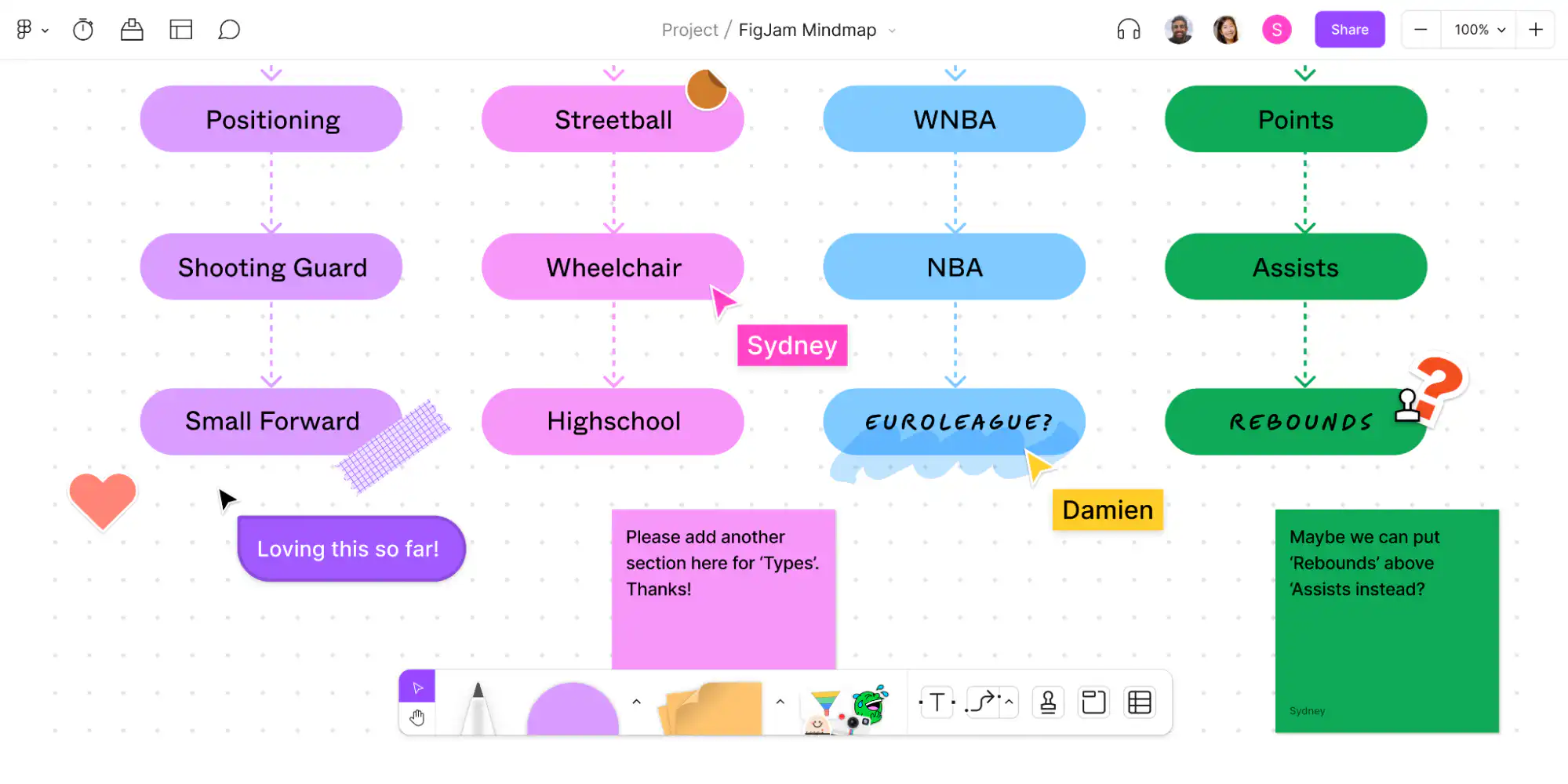
Figma is challenging Sketch's dominance with similar features and notable advantages like real-time collaboration in both design and prototyping, as well as cross-platform compatibility with Macs, Windows, Linux, and Chromebooks, enhancing teamwork across diverse preferences.

Overview
Zeplin bridges the gap between design and development teams. It allows for easy exportation of designs from various tools and automatically generates development resources, turning UI designs into guidelines and code snippets.

Overview
UXPin is a comprehensive design platform promoting collaboration and interaction with fully-interactive wireframes and prototypes among designers, developers, and stakeholders.

Overview
Principle enables the creation of interactive UIs and unique interactions for multi-screen apps. It supports importing files from other apps and adds animations, with its latest version also accessible offline on the web.

Overview
Sketch is a MacBook-based UI/UX design tool optimized for app prototyping. It's efficient, and requires a one-time purchase with an annual license renewal. While it lacks animation capabilities, it's widely used for wireframing and prototyping in conjunction with tools like Photoshop for photo editing.

Overview
BuildFire is an all-encompassing app development platform allowing mobile app designers to create working prototypes with customizable designs, fonts, and colors. Its built-in functionality may cover all needs for a publishable app on iOS and Google Play stores.

Overview
Adobe After Effects stands out for motion design and animations, enabling mobile app animation and video work with presets, effects, and new integrations like Cinema 4D for 3D manipulation. Its LottieFiles plugin is particularly valued for creating and testing vector animations without coding.
Designing your app is the most important task
This guide has provided you with the tools and knowledge needed to bring your app idea to life. From understanding design processes and platforms to utilizing user experience tips and cost-saving solutions, we've covered it all. If you are ready to start building your mobile app, take a look at these top 10 best app builders.
Fliplet is a top choice for app design because it's really easy to use, even if you're not a tech expert. It has lots of ready-made templates that you can change to fit what you need. It's also great because you can see what your app will look like on different devices before it goes live. This way, you can make sure it works well for everyone. Plus, once you're done, you can put your app in the Apple and Google stores right from Fliplet. This makes the whole app-making process a lot simpler and faster.
Creating a successful app is about combining great design with functionality, offering an intuitive and engaging user experience. With the insights and tools provided here, you're well-equipped to design apps that not only look good but also resonate with users. Dive in, get creative, and start building standout apps today for book a demo.
Lisa Broom is the Head of Marketing at Fliplet, where she helps enterprise teams turn complex workflows into secure, user-friendly digital experiences.


Ready to see Fliplet live?
Build the software you actually need.
Book a demo to walk through your workflow goals, governance requirements, integration needs, and rollout model.